Client
Kodesolution Ltd
Category
Graphic design, Marketing
Cost
USD 1,50,499
Date
July 26, 2023

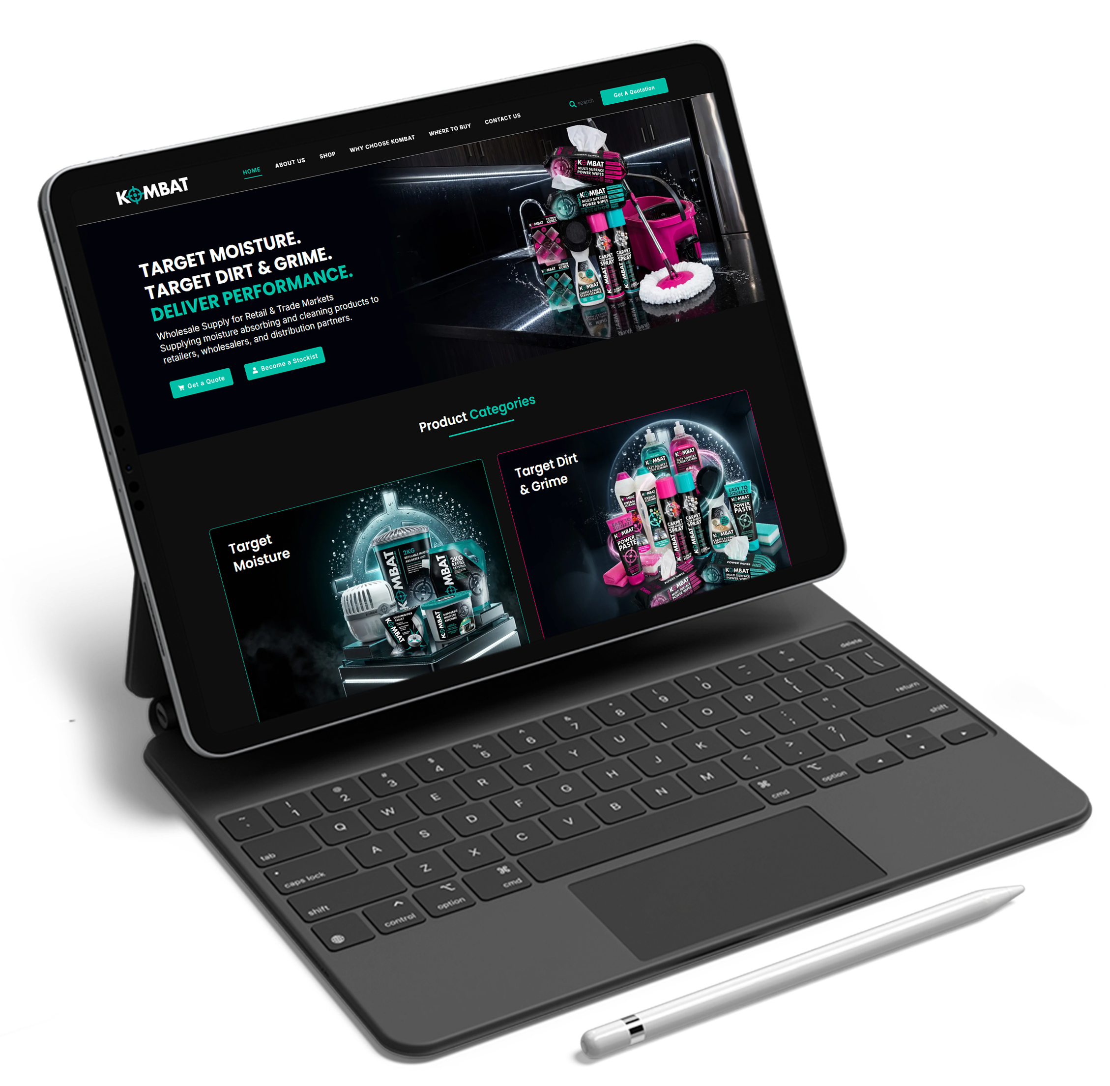
Kombat UK required a modern, scalable website that could effectively showcase its extensive range of military, tactical, outdoor, and camping products while delivering a seamless shopping experience.
The objective was to design and develop a professional WordPress website that balanced strong brand identity, intuitive navigation, and eCommerce functionality for both retail and trade customers.
Design & Development Goals
Structured User Experience
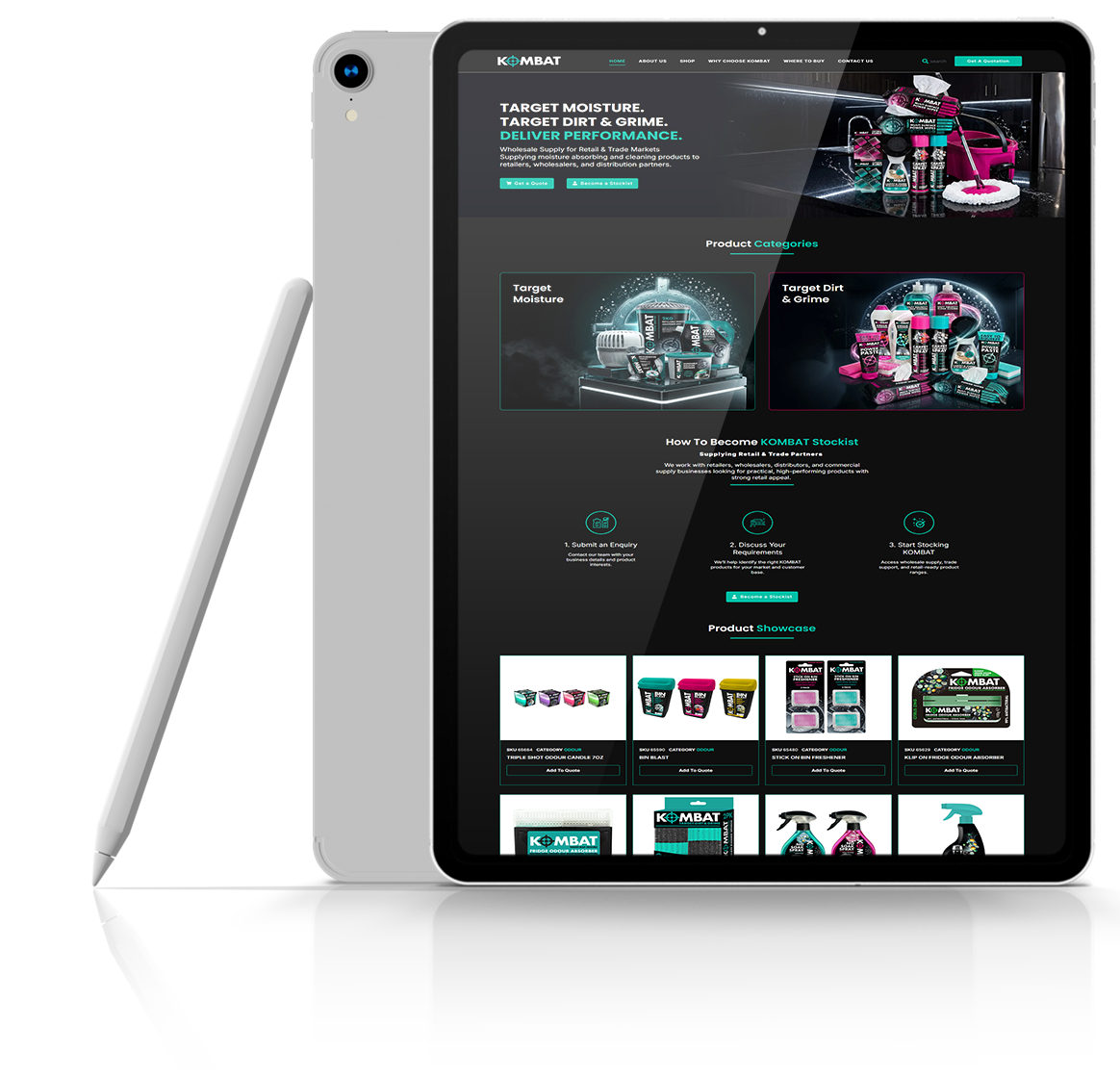
The website was designed with a clear information architecture, making it easy for visitors to browse categories, discover products, and access important information quickly.
Brand-Focused Visual Design
The design reflects Kombat UK’s tactical and military heritage through:
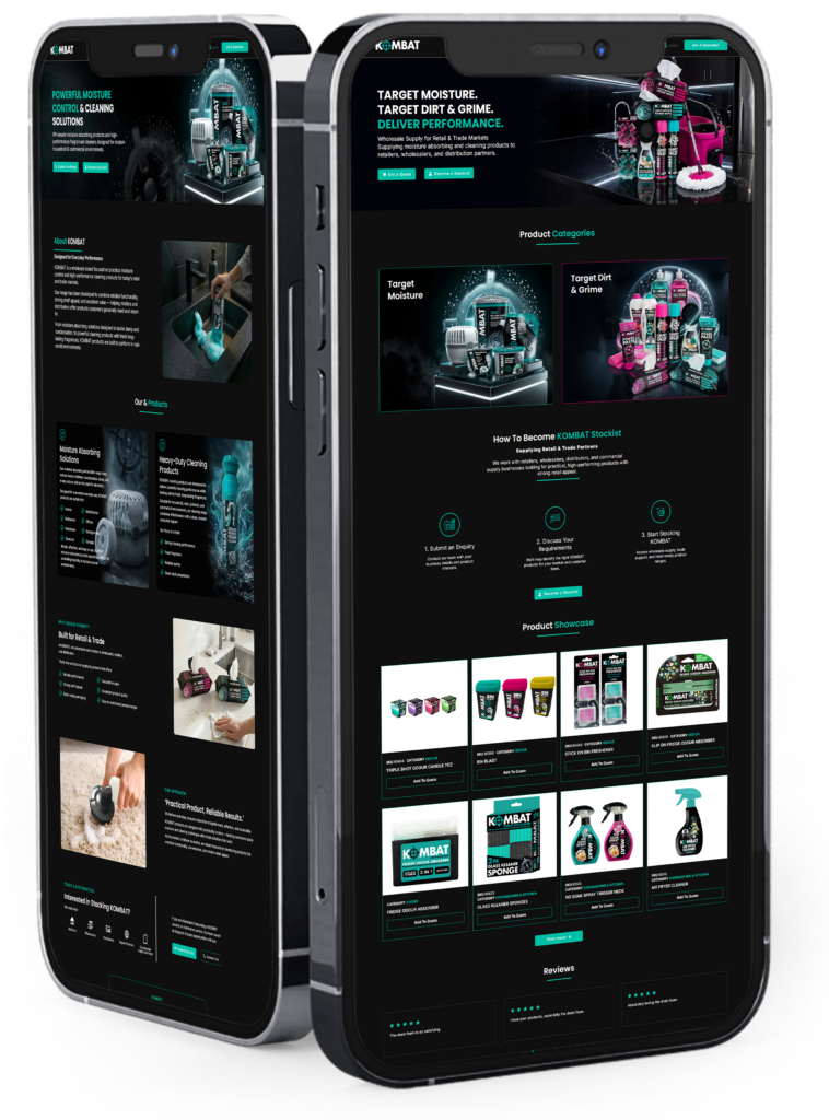
Mobile-First Design
Every page was optimized to ensure a smooth experience across desktop, tablet, and mobile devices.
WordPress Development
eCommerce Optimization
Performance & Usability
The new WordPress website provides Kombat UK with a professional and modern digital storefront that aligns with its established reputation in the tactical and outdoor equipment market.
The improved design and development framework delivers a better customer experience, stronger product visibility, and a scalable foundation for future online growth.
The redesign focused on making it easier for customers to find products quickly. With clearer navigation, better category organization, and improved product layouts, visitors can browse large inventories without feeling overwhelmed.
WordPress offered the flexibility needed to manage a large and evolving product catalog while giving the Kombat UK team complete control over content updates and future website growth.
The website uses strong visual hierarchy, bold typography, high-quality imagery, and structured layouts that align with Kombat UK’s established reputation in the military and outdoor equipment industry.
One of the main challenges was organizing a large number of product categories and ensuring users could easily navigate between them. The final structure creates a smoother path from product discovery to purchase.
The platform was built with scalability in mind, allowing new product ranges, content sections, and marketing initiatives to be added without requiring a complete redesign.
The website was developed using a mobile-first approach, ensuring customers can comfortably browse products, view details, and navigate the site on any device
